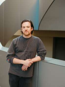
Courtesy of David Michon
COLLECTIBLE Three questions to
David Michon
November 2026
Today, we have the pleasure of speaking with David Michon, a writer, editor and critic, who is curating the CURATED section of COLLECTIBLE Brussels 2027, which marks ten years of the fair in Brussels. As the founder of FOR SCALE, an award-winning magazine and newsletter of décor criticism based between New York, Paris and Sydney, and the former editor of Icon and managing editor of Monocle, he has built a distinctive voice on how we live with objects and spaces, with contributions to publications including Acne Paper, PIN-UP and L’Uomo Vogue. In our conversation, David Michon reflects on his choice of a single color, BLUE, as this year’s theme, and on how far designers might take it.
COLLECTIBLE: Most open calls begin with a concept. You chose a color: something you feel before you think about it. Why start CURATED from something so immediate, and why BLUE?
David Michon: Okay, well, what is “a concept” anyway? Some abstract idea you think carries some human question: What is or isn’t freedom? What is or isn’t a chair? What would exclude a color from this sort of scrutiny? Like anything else, it has meaning to us only because we assign it so... it’s a deceptively simple thing, “blue”, when really it contains a f*ck load of ideas. No such thing as a “simple” idea.
I wanted a theme that slapped you in the face, where there was no question what connected everything. This way, you can spend your mental energy not by connecting dots, but by ripping them apart. What separates these interpretations of “blue”? It’ll be up to us as curators to make that an interesting thing to do.
Why blue and not some other color? I like blue, and I’m selfish.
C: In design, color is often treated as a finishing touch, chosen once the form is resolved. Your theme puts it first. What changes when a designer starts with color instead of ending with it?
DM: Yeah, great point. I am hoping that contributors maybe have fun reversing their (thought) process. Take this thing that’s sort of seen as the most easily variable... the color of the paint, the glaze, the stain, the fabric... and setting that as the only parameter.
That said, maybe some of what people will submit to us won’t be blue at all, but a reaction to blue.
C: How far can a piece move from the color itself and still belong in the section?
DM: In basic terms maybe, like any color it’s got its complement.
More meanderingly: like any color, it’s a part of history, and ideas, and language. There are innumerable books dedicated to blue, or that use it as a starting point: Maggie Nelson’s Bluets, Kate Braverman’s Squandering the Blue, Michel Pastoureau’s Blue: The History of a Color. Or visual artists, filmmakers, musicians who throw themselves at it: Yves Klein, Derek Jarman, Joni Mitchell, et cetera, et cetera.
Blue, you’ve gotta say, is also a little bit of a gateway into a bunch of other places, otherwise we wouldn’t have such a robust niche of culture fixated on it.
Courtesy of David Michon
COLLECTIBLE Three questions to
David Michon
November 2026
Today, we have the pleasure of speaking with David Michon, a writer, editor and critic, who is curating the CURATED section of COLLECTIBLE Brussels 2027, which marks ten years of the fair in Brussels. As the founder of FOR SCALE, an award-winning magazine and newsletter of décor criticism based between New York, Paris and Sydney, and the former editor of Icon and managing editor of Monocle, he has built a distinctive voice on how we live with objects and spaces, with contributions to publications including Acne Paper, PIN-UP and L’Uomo Vogue. In our conversation, David Michon reflects on his choice of a single color, BLUE, as this year’s theme, and on how far designers might take it.
COLLECTIBLE: Most open calls begin with a concept. You chose a color: something you feel before you think about it. Why start CURATED from something so immediate, and why BLUE?
David Michon: Okay, well, what is “a concept” anyway? Some abstract idea you think carries some human question: What is or isn’t freedom? What is or isn’t a chair? What would exclude a color from this sort of scrutiny? Like anything else, it has meaning to us only because we assign it so... it’s a deceptively simple thing, “blue”, when really it contains a f*ck load of ideas. No such thing as a “simple” idea.
I wanted a theme that slapped you in the face, where there was no question what connected everything. This way, you can spend your mental energy not by connecting dots, but by ripping them apart. What separates these interpretations of “blue”? It’ll be up to us as curators to make that an interesting thing to do.
Why blue and not some other color? I like blue, and I’m selfish.
C: In design, color is often treated as a finishing touch, chosen once the form is resolved. Your theme puts it first. What changes when a designer starts with color instead of ending with it?
DM: Yeah, great point. I am hoping that contributors maybe have fun reversing their (thought) process. Take this thing that’s sort of seen as the most easily variable... the color of the paint, the glaze, the stain, the fabric... and setting that as the only parameter.
That said, maybe some of what people will submit to us won’t be blue at all, but a reaction to blue.
C: How far can a piece move from the color itself and still belong in the section?
DM: In basic terms maybe, like any color it’s got its complement.
More meanderingly: like any color, it’s a part of history, and ideas, and language. There are innumerable books dedicated to blue, or that use it as a starting point: Maggie Nelson’s Bluets, Kate Braverman’s Squandering the Blue, Michel Pastoureau’s Blue: The History of a Color. Or visual artists, filmmakers, musicians who throw themselves at it: Yves Klein, Derek Jarman, Joni Mitchell, et cetera, et cetera.
Blue, you’ve gotta say, is also a little bit of a gateway into a bunch of other places, otherwise we wouldn’t have such a robust niche of culture fixated on it.
