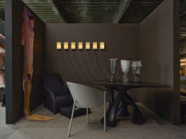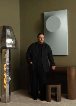


Michael Hilal, booth at COLLECTIBLE New York 2025 supported by F&B © Jonathan Hökklo
COLLECTIBLE Three Questions To — Michael Hilal
(Vignette supported by Farrow & Ball)
October 2025
For COLLECTIBLE New York 2025, Farrow & Ball, the renowned British paint and wallpaper house, supported the Vignette section, bringing their distinctive palette and sensibility to the spaces imagined by our exhibitors. Their colors became more than backdrop — they shaped atmosphere, highlighted materiality, and infused each setting with depth and character.
We asked to our exhibitors three questions about their collaboration, their creative process, and the role of color in their work.
C: Which Farrow & Ball shade did you choose, and how did it shape your creative vision?
Michael Hilal: I chose ‘London Clay’ because I wanted the walls to do more than hold the space — I wanted them to shape it. The depth of the color absorbs light and slows the eye, creating a mood that’s equal parts atmospheric and architectural. Against that kind of backdrop, every element — from the sculptural dining table to the Starck chair — reads with greater intention, as if the room is curating itself. It’s not a passive neutral; it’s a co-author in the composition, setting the tone for a space that feels studied yet effortless, refined but still inviting.
C: What role does color play in your practice, and how did it come to life through this collaboration with Farrow & Ball?
MH: Color is one of the foundational tools in my work — it dictates how a room unfolds, how texture and form reveal themselves, and ultimately how a space makes you feel. My approach has always been about balancing sophistication with ease, and creating interiors that feel deeply considered without ever tipping into formality. ‘London Clay’ embodies that philosophy perfectly: it has a quiet depth that allows materials, silhouettes, and light to evolve slowly, the way California spaces often do when architecture and atmosphere are in dialogue. With Farrow & Ball, the palette becomes part of the architecture, not just the backdrop.
C: What has been the most rewarding or impactful part of your COLLECTIBLE New York 2025 experience?
MH: The most rewarding part of COLLECTIBLE was getting to approach design from two perspectives — as both a curator and a participant. Curating the new Vignette section was an opportunity to think about design as a larger conversation: how collectible objects, art, and even color can shift meaning when placed in dialogue with one another. At the same time, presenting my own vignette allowed me to express that philosophy more personally — from the tension and mystery of Samantha McCurdy’s sculptural work to the depth and mood created by Farrow & Ball’s ‘London Clay.’
One of the more interesting decisions I made was bringing in two 1990s chairs — an anomaly for a fair that tends to focus strictly on contemporary work. But that friction was the point. Their presence created a dialogue with the new pieces, raising questions about authorship, context, and how design evolves when eras collide.Other pieces I pulled in were by Ian Spencer, Kiki Goti, Armadillo and art by Vaughn Davis Jr. It wasn’t just about showing pieces I love; it was about shaping a narrative — exploring how thoughtful curation can transform a space into something layered, emotional, and deeply resonant. Watching people slow down, look closer, and connect with that story was a powerful reminder of why I do what I do.

© Katie McCurdy
Vignette section supported by Farrow & Ball

Michael Hilal, booth at COLLECTIBLE New York 2025 supported by F&B © Jonathan Hökklo
COLLECTIBLE Three Questions To — Michael Hilal
(Vignette supported by Farrow & Ball)
October 2025
For COLLECTIBLE New York 2025, Farrow & Ball, the renowned British paint and wallpaper house, supported the Vignette section, bringing their distinctive palette and sensibility to the spaces imagined by our exhibitors. Their colors became more than backdrop — they shaped atmosphere, highlighted materiality, and infused each setting with depth and character.
We asked to our exhibitors three questions about their collaboration, their creative process, and the role of color in their work.
C: Which Farrow & Ball shade did you choose, and how did it shape your creative vision?
Michael Hilal: I chose ‘London Clay’ because I wanted the walls to do more than hold the space — I wanted them to shape it. The depth of the color absorbs light and slows the eye, creating a mood that’s equal parts atmospheric and architectural. Against that kind of backdrop, every element — from the sculptural dining table to the Starck chair — reads with greater intention, as if the room is curating itself. It’s not a passive neutral; it’s a co-author in the composition, setting the tone for a space that feels studied yet effortless, refined but still inviting.
C: What role does color play in your practice, and how did it come to life through this collaboration with Farrow & Ball?
MH: Color is one of the foundational tools in my work — it dictates how a room unfolds, how texture and form reveal themselves, and ultimately how a space makes you feel. My approach has always been about balancing sophistication with ease, and creating interiors that feel deeply considered without ever tipping into formality. ‘London Clay’ embodies that philosophy perfectly: it has a quiet depth that allows materials, silhouettes, and light to evolve slowly, the way California spaces often do when architecture and atmosphere are in dialogue. With Farrow & Ball, the palette becomes part of the architecture, not just the backdrop.
C: What has been the most rewarding or impactful part of your COLLECTIBLE New York 2025 experience?
MH: The most rewarding part of COLLECTIBLE was getting to approach design from two perspectives — as both a curator and a participant. Curating the new Vignette section was an opportunity to think about design as a larger conversation: how collectible objects, art, and even color can shift meaning when placed in dialogue with one another. At the same time, presenting my own vignette allowed me to express that philosophy more personally — from the tension and mystery of Samantha McCurdy’s sculptural work to the depth and mood created by Farrow & Ball’s ‘London Clay.’
One of the more interesting decisions I made was bringing in two 1990s chairs — an anomaly for a fair that tends to focus strictly on contemporary work. But that friction was the point. Their presence created a dialogue with the new pieces, raising questions about authorship, context, and how design evolves when eras collide.Other pieces I pulled in were by Ian Spencer, Kiki Goti, Armadillo and art by Vaughn Davis Jr. It wasn’t just about showing pieces I love; it was about shaping a narrative — exploring how thoughtful curation can transform a space into something layered, emotional, and deeply resonant. Watching people slow down, look closer, and connect with that story was a powerful reminder of why I do what I do.

© Katie McCurdy
Vignette section supported by Farrow & Ball